Bilo
For decades, Bilotserkivka Agroindustrial Group (branded as Bilotserkivske) has been offering a variety of dairy products that taste genuinely homemade. Their rapid growth in popularity and modernized production facilities have prompted the company to transition from the local to the national market. We were invited to create the brand's new appearance and packaging for the primary product lines while adhering to the "white" visual strategy suggested by the in-house marketing team. Early research confirmed that most competitors favored designs dominated by the color white. Thus, we accepted the challenge of creating the whitest packaging on the shelves.
Client: Bilotserkivka Agroindustrial Group
Services: Visual strategy, Art direction, Packaging, Typography.
Year: 2021-2022
Services: Visual strategy, Art direction, Packaging, Typography.
Year: 2021-2022
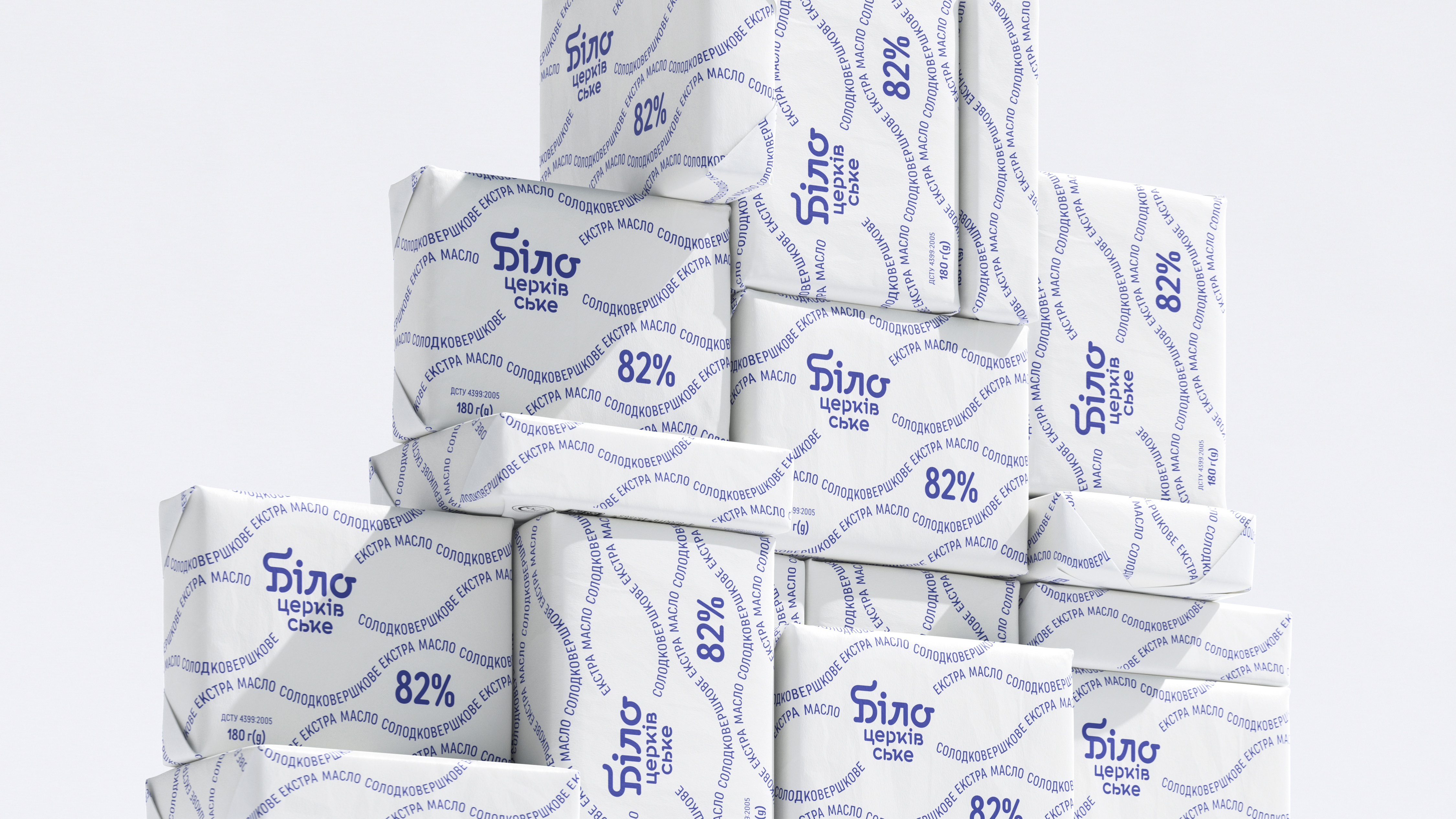
We started with the brand's name transformation, planned in two phases. During the first stage, we highlighted the initial four letters in the name "Bilotserkivske," which means "White." During the second stage, we recommended reducing the brand's name to simply "Bilo."
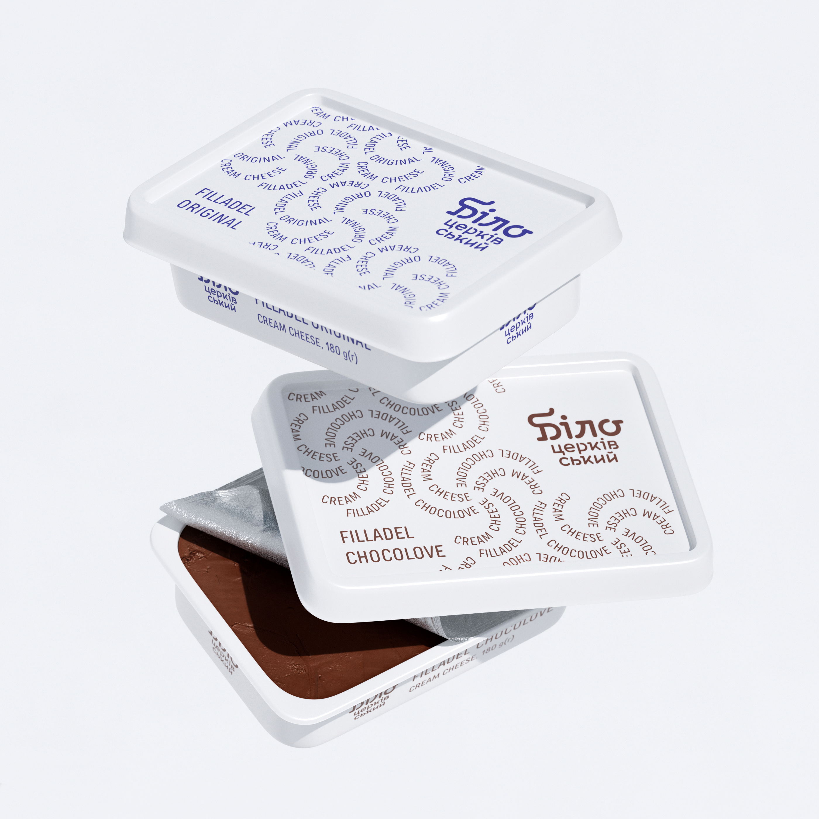
Pursuing the "whitest packaging on the shelves," we embraced an ascetic approach. By eliminating excessive graphic and text information, we focused on white space and enhanced the readability of the most critical messages. Typographic patterns, created from product names, help maintain a minimalist yet distinctive look of the packaging while categorizing different lines.
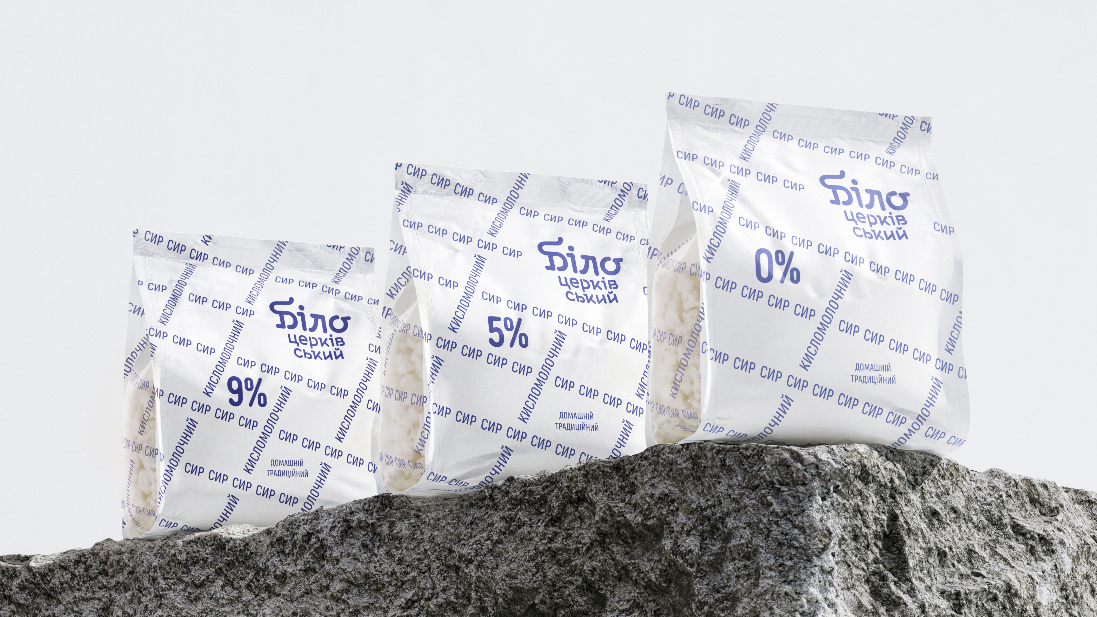
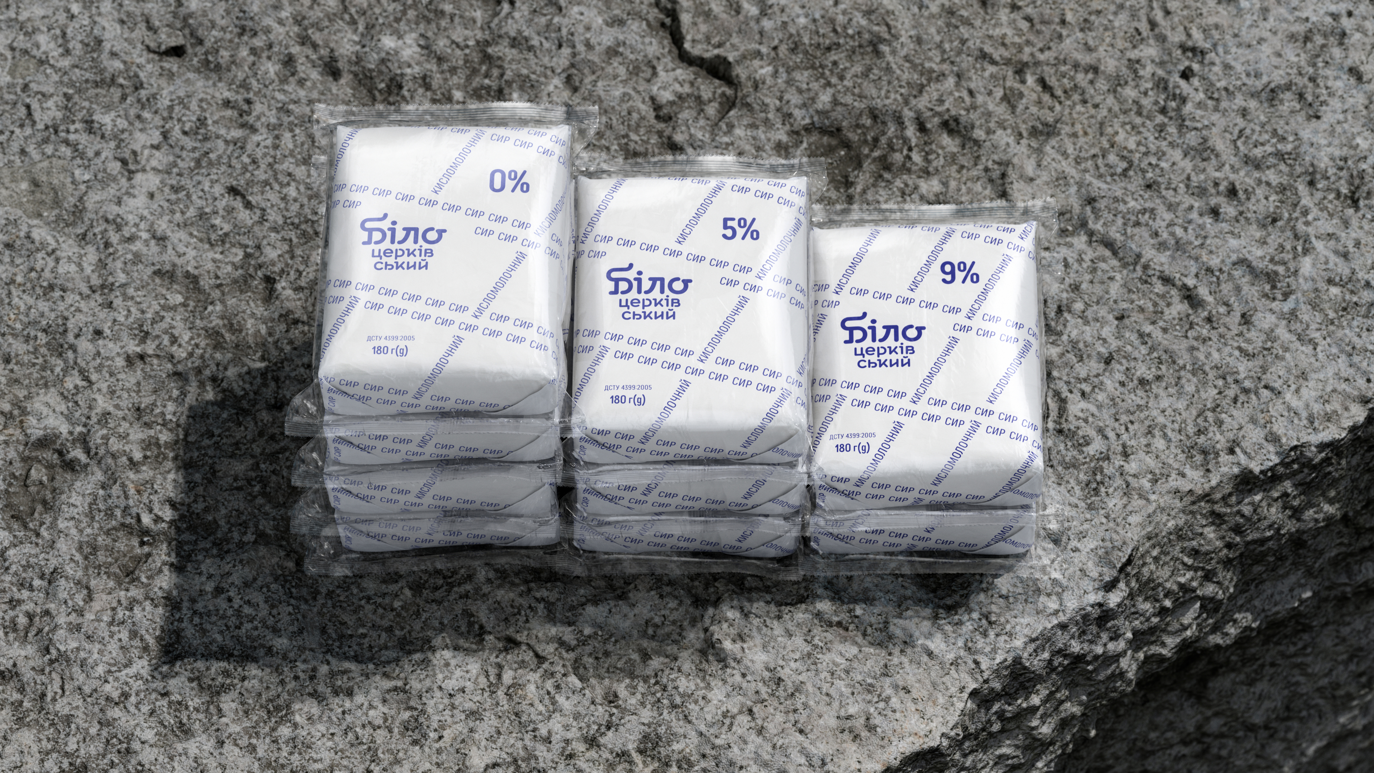
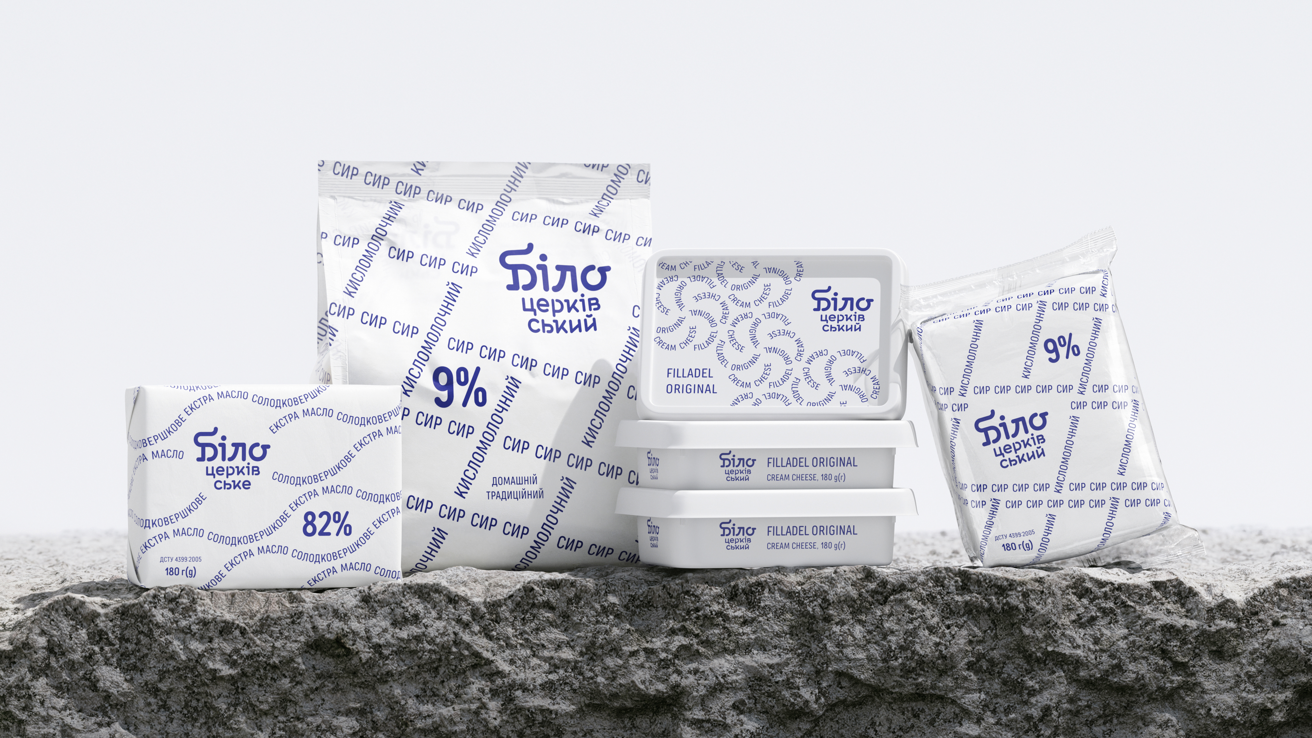
The simplicity of a creative solution is revolutionary for the market. Additionally, a well-structured design system allows maximum flexibility for identity development.
Today, Bilo is the most noticeable brand in the highly competitive Ukrainian dairy segment, with its delicious products winning over a growing fan audience.
Awards
︎ Pentawards 2023
Bronze in Dairy and soy based products
Bronze in Dairy and soy based products