Brun'ka
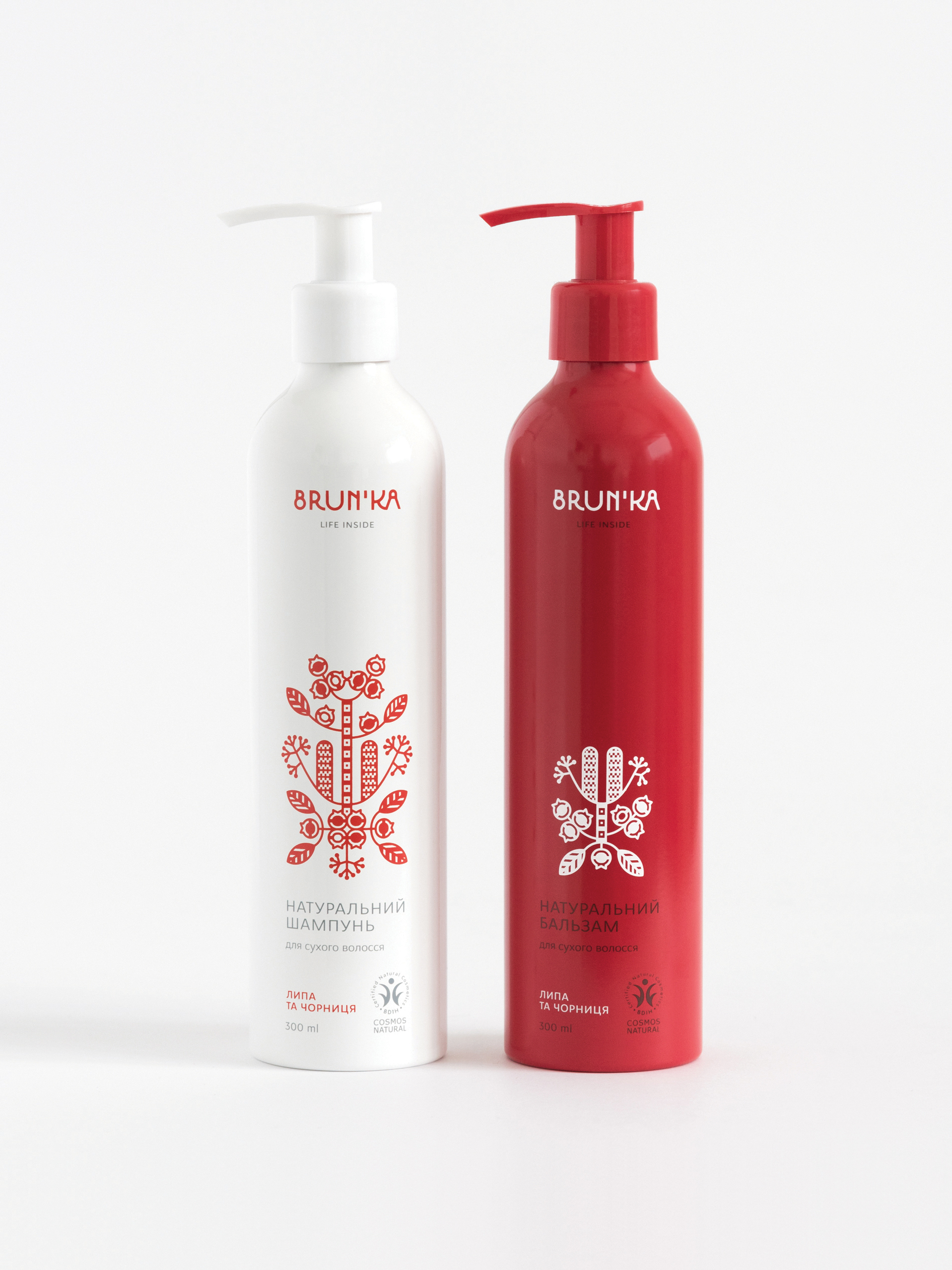
Brun'ka is the first Ukrainian brand that offers certified organic cosmetics based upon herbs common in Ukraine and traditionally used in ancient beauty recipes. The brand name Brun'ka means a bud. Together with the company's motto, "Life inside," it reveals the main idea behind the cosmetics line — to celebrate the energy of nature.
Client: Ecolife
Services: Visual strategy, Art direction, Packaging, Illustration, Typography.
Year: 2016
Services: Visual strategy, Art direction, Packaging, Illustration, Typography.
Year: 2016
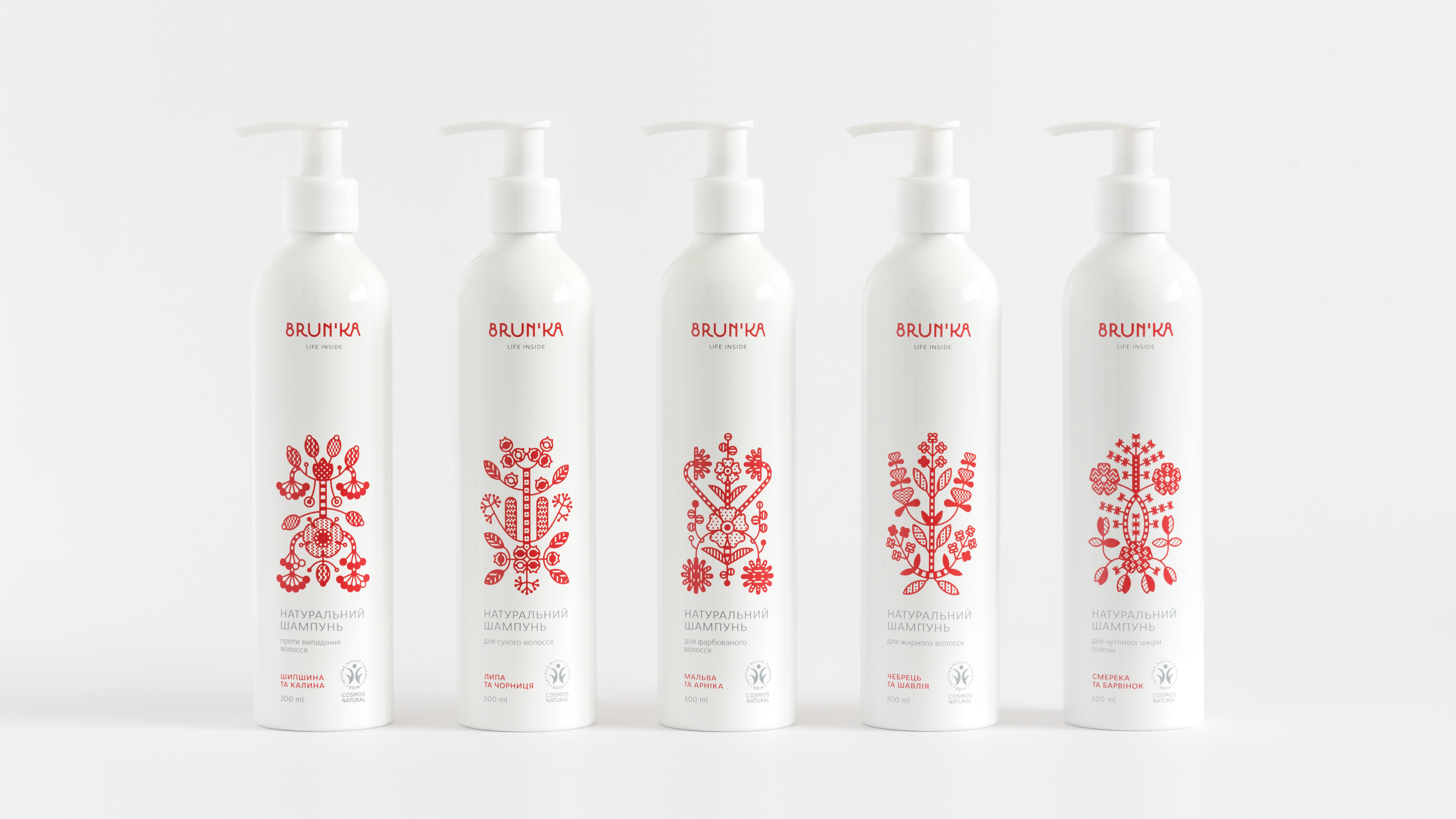
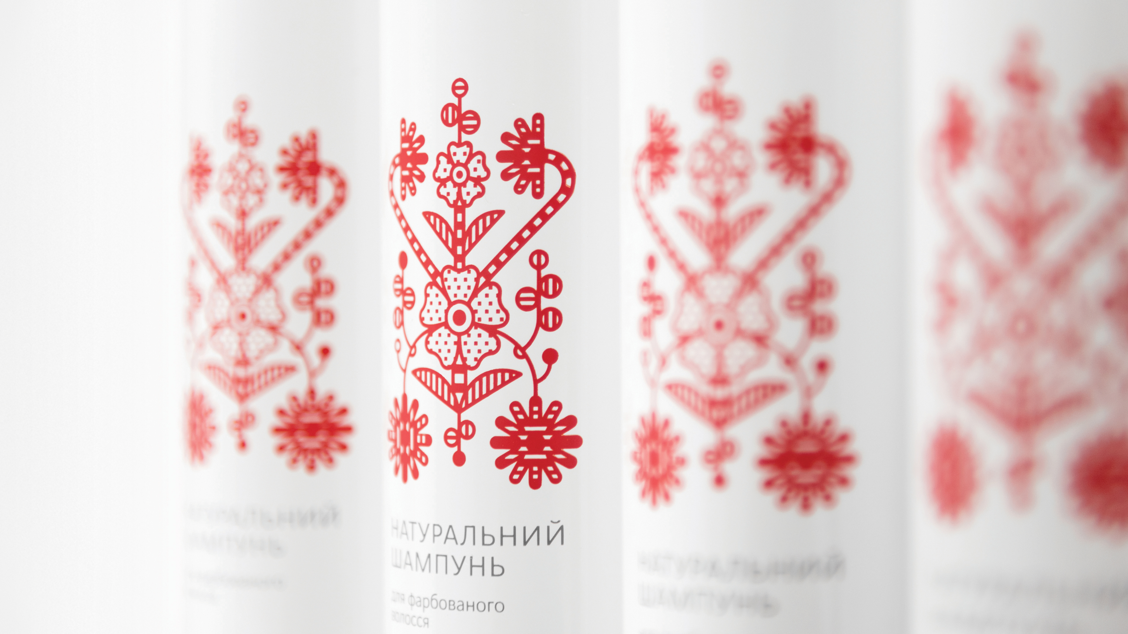
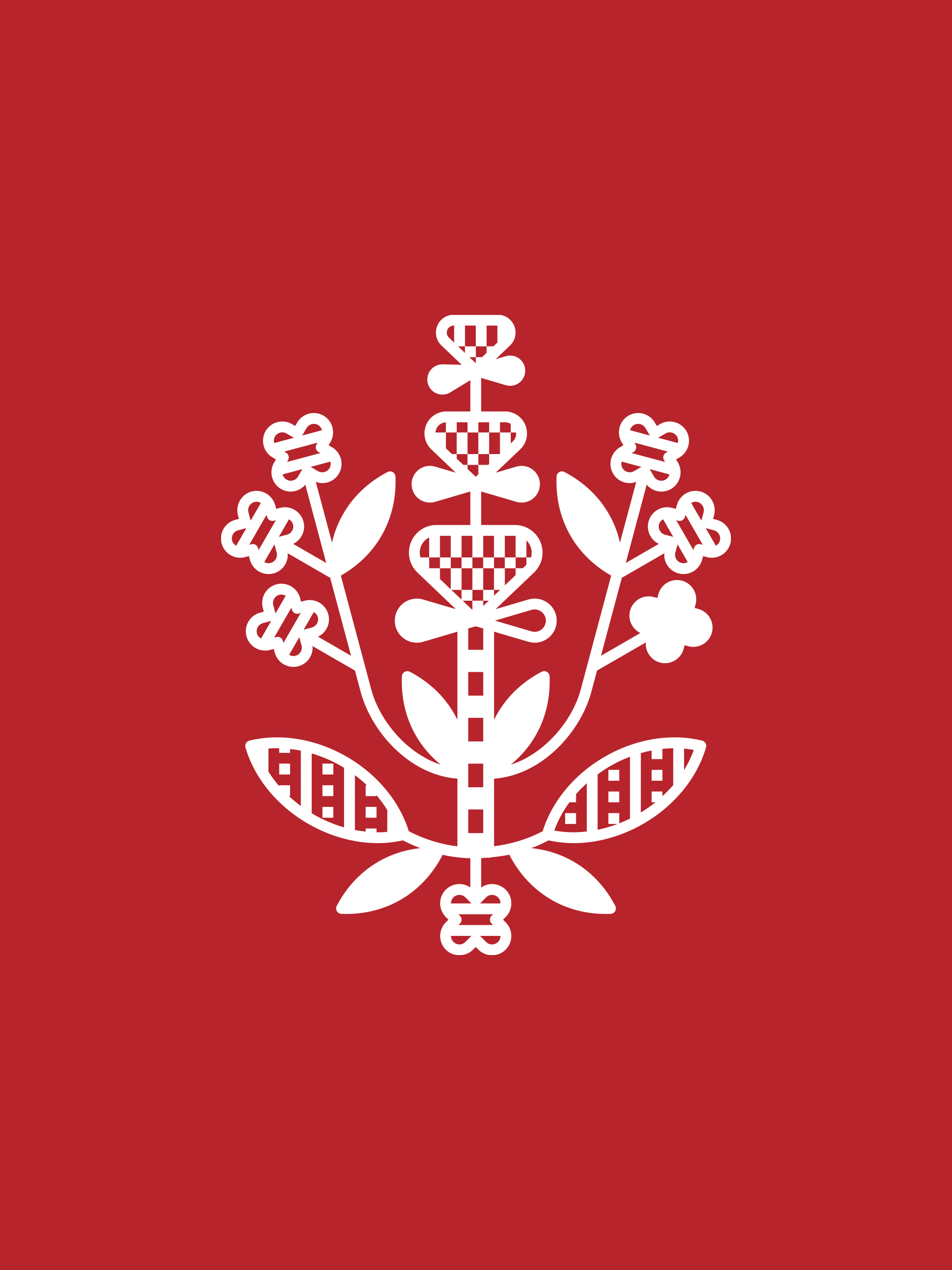
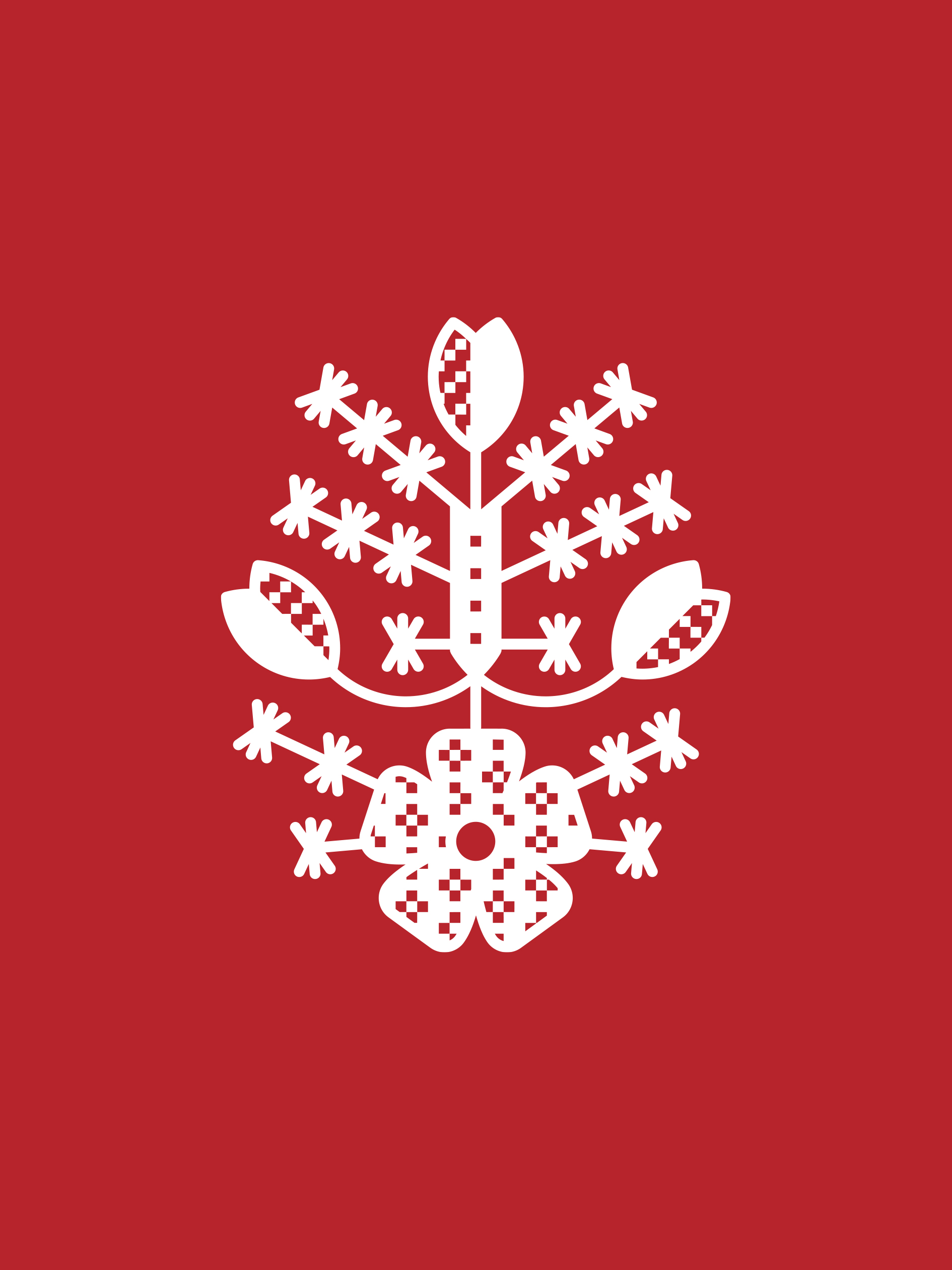
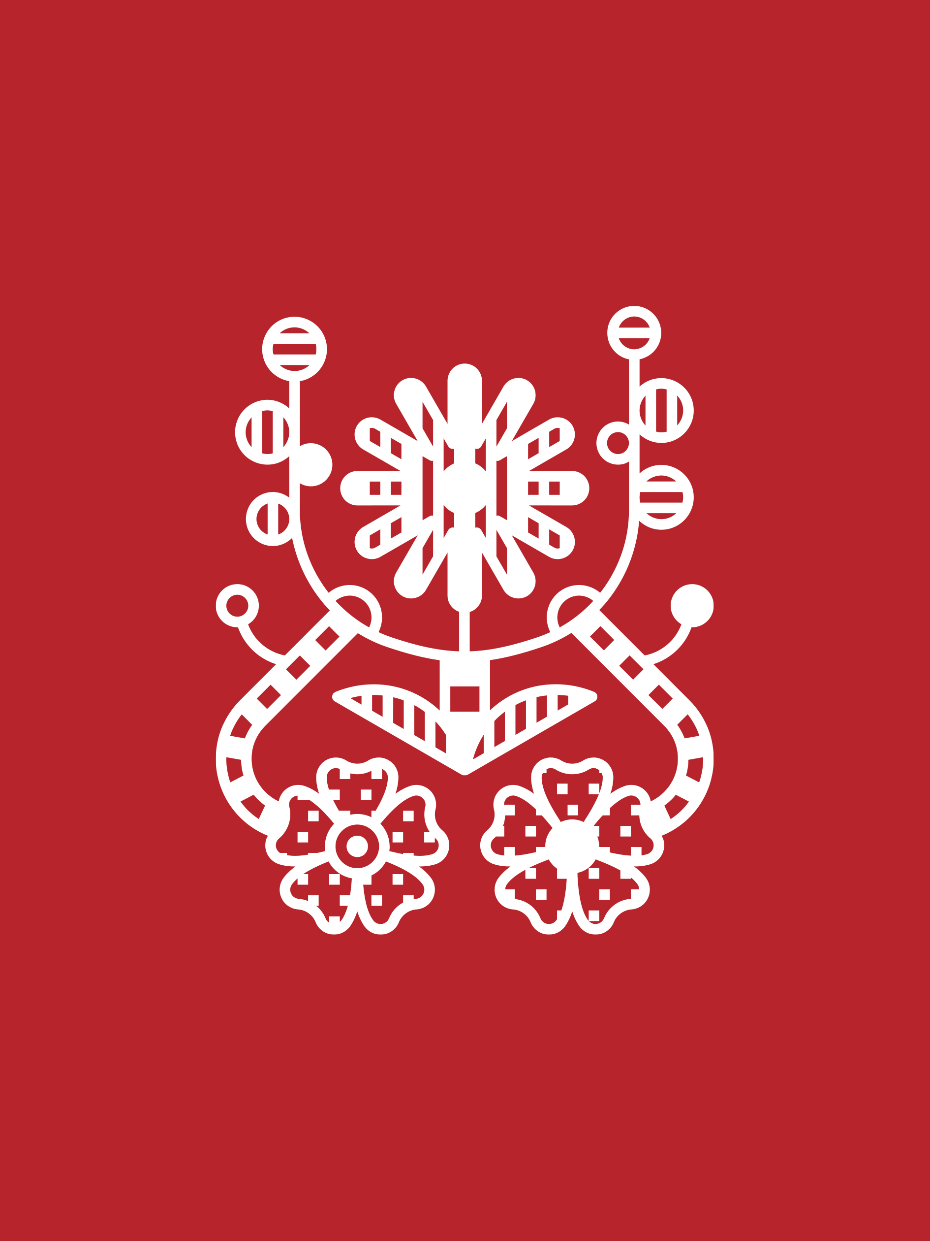
While working on this project, we aimed to combine contemporary design aesthetics with the original Ukrainian spirit. Rushnyk ornaments traditional to central Ukraine inspired the visual language of the brand. Rushnyk (the first mention belongs to the early 17th century) is an embroidered cloth with ritualistic (ceremonial) and decorative purposes. The central motif of these embroidered masterpieces is the tree of life, a sacred Slavic symbol that stands for the Universe and harmony. Red floral ornaments symbolize health and beauty.
The brand embraces magnificence and simplicity, represented in strictly symmetrical graphic bouquets. Each ornament on the package shows the exact herbal composition of a specific product. All ornaments have lovely natural imperfections as they were taken directly from authentic handcrafted rushnyks or created by nature out of wild herbs.


Awards
︎ European Design Awards 2017
Bronze in Packaging (Health and beauty)
︎ HOW International Design Annual 2018
Winner in Packaging design
Bronze in Packaging (Health and beauty)
︎ HOW International Design Annual 2018
Winner in Packaging design
︎ Ukrainian Design: The Very Best Of 2017
Winner in Graphic design (Packaging)
︎ Ukrainian Design: The Very Best Of 2017
Winner in Graphic design (Logo)
Winner in Graphic design (Packaging)
︎ Ukrainian Design: The Very Best Of 2017
Winner in Graphic design (Logo)