Le Beau
Le Beau is a Toronto-based French-style patisserie founded by pastry chef Olga Spivak. She honed her skills with Alain Ducasse at the Ecole Nationale Supérieure de la Pâtisserie, and worked in Paris under the guidance of a Meilleur Ouvrier de France. Her passion for the highest quality ingredients, craftsmanship, respect for traditions, and professional perfectionism enabled her to open a cafe that indulges the most demanding sweets enthusiasts.
Client: Le Beau Lab
Services: Visual strategy, Art direction, Packaging, Identity, Typography.
Year: 2018-2023
Services: Visual strategy, Art direction, Packaging, Identity, Typography.
Year: 2018-2023

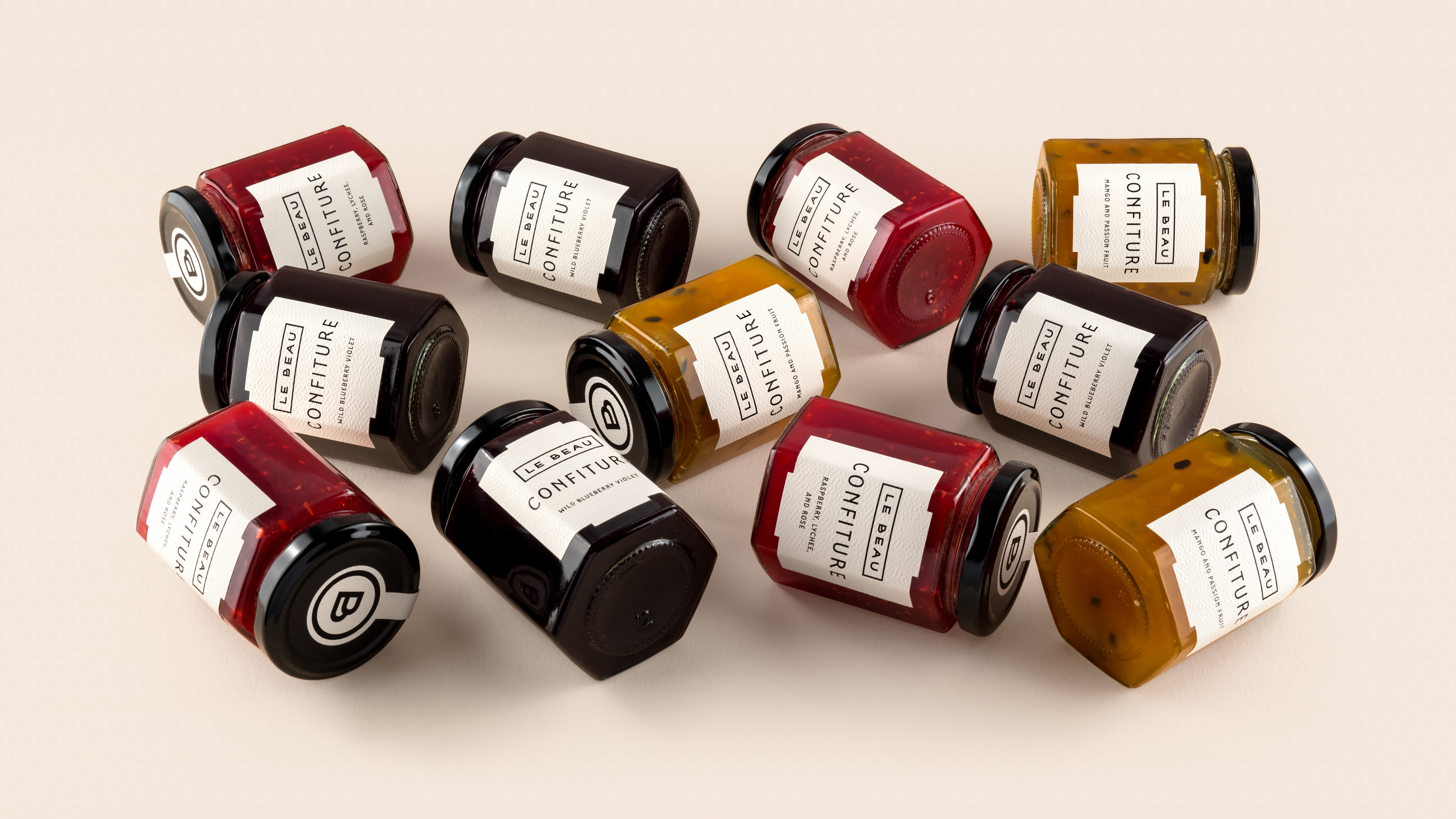
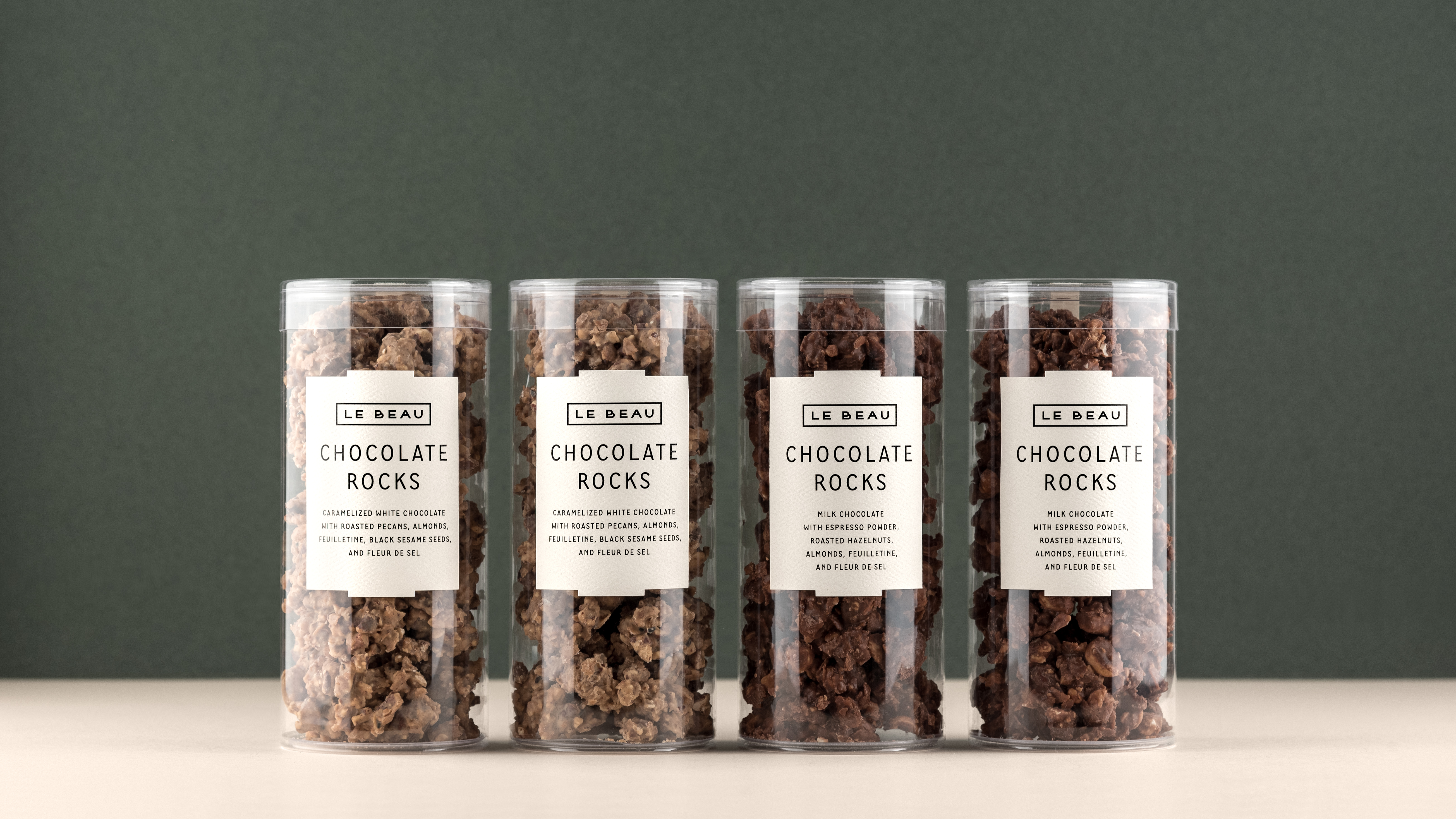
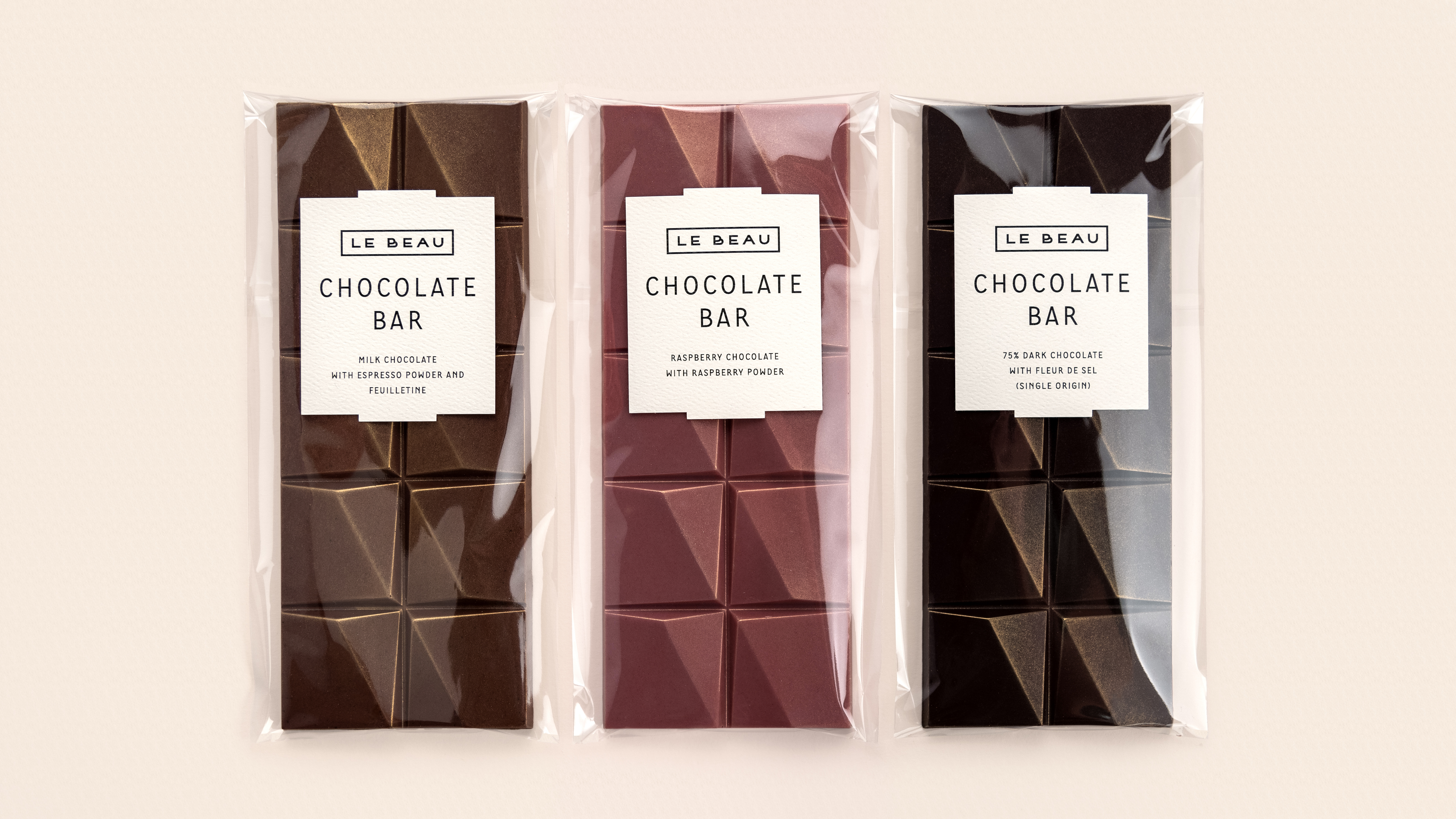
We were asked to develop the visual identity, an exclusive typeface, and a highly flexible labelling system, allowing easy changes to product names, flavours or ingredients and accommodating different packaging shapes while producing small batches in-house.
Le Beau's identity offers a tranquil and minimalist aesthetic, striking a balance of contemporary and classic elements. The pastel colour blend reflects the establishment’s relaxing atmosphere, natural flavours, and organic ingredients. A subtle art deco touch pays homage to an old Toronto style and French cultural heritage.


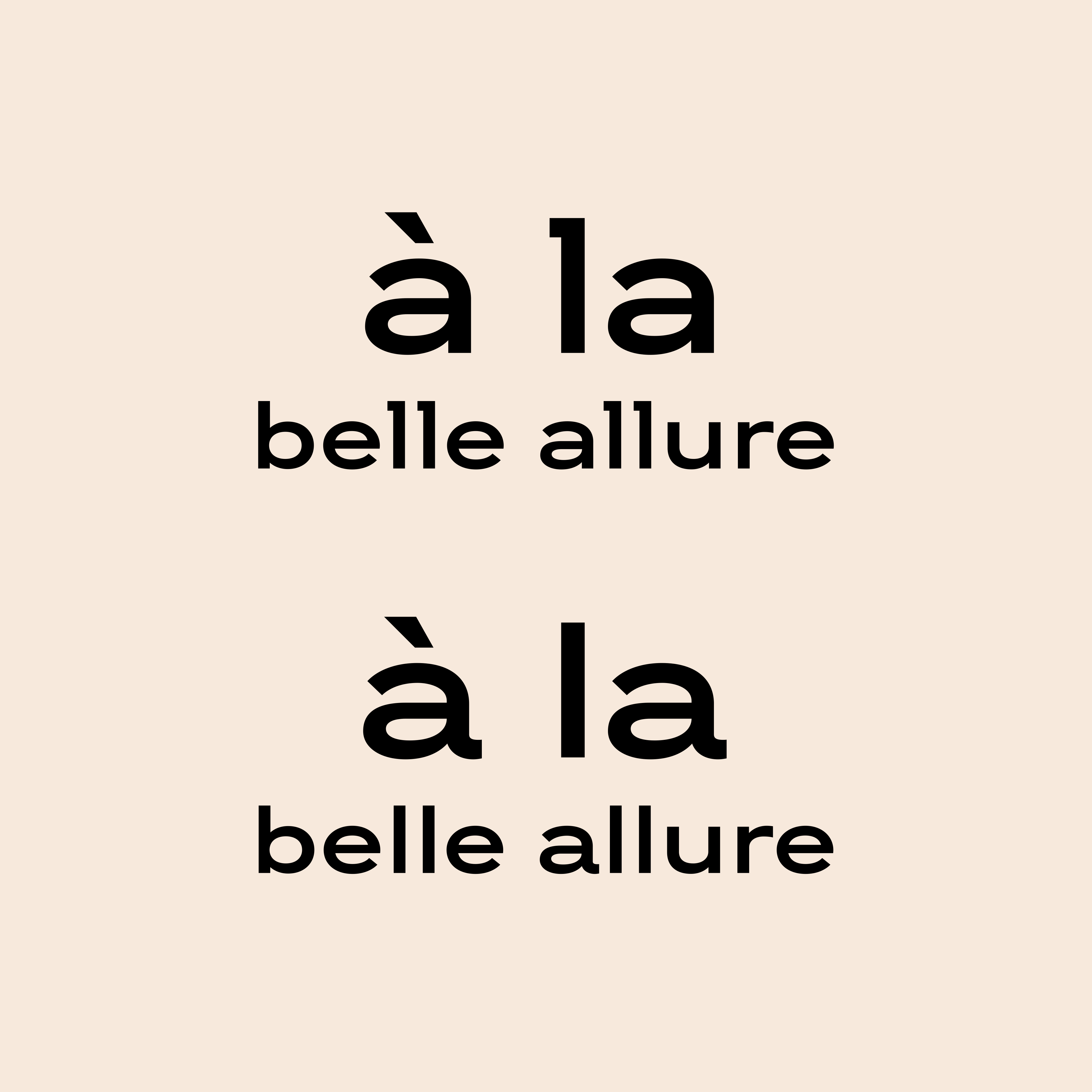


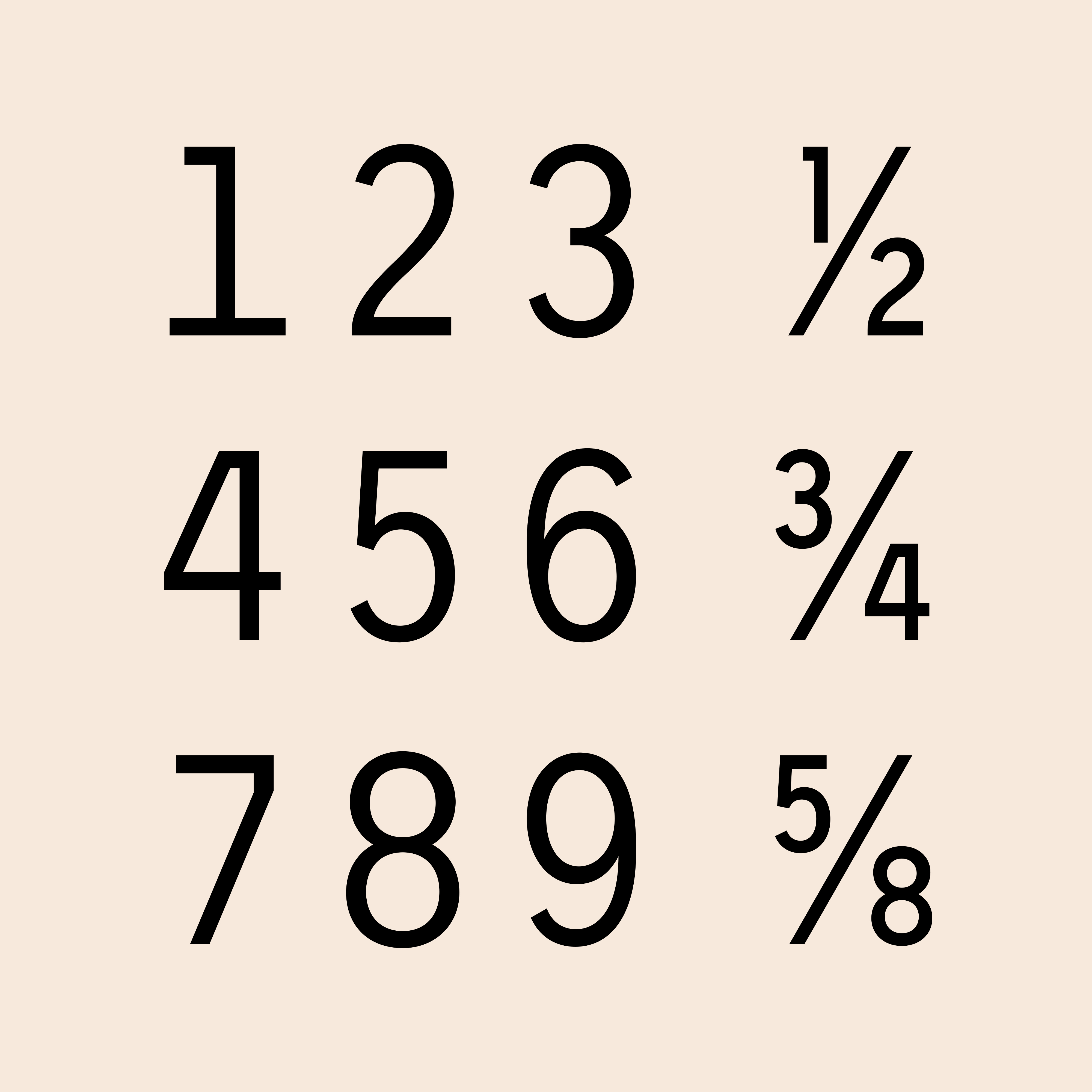
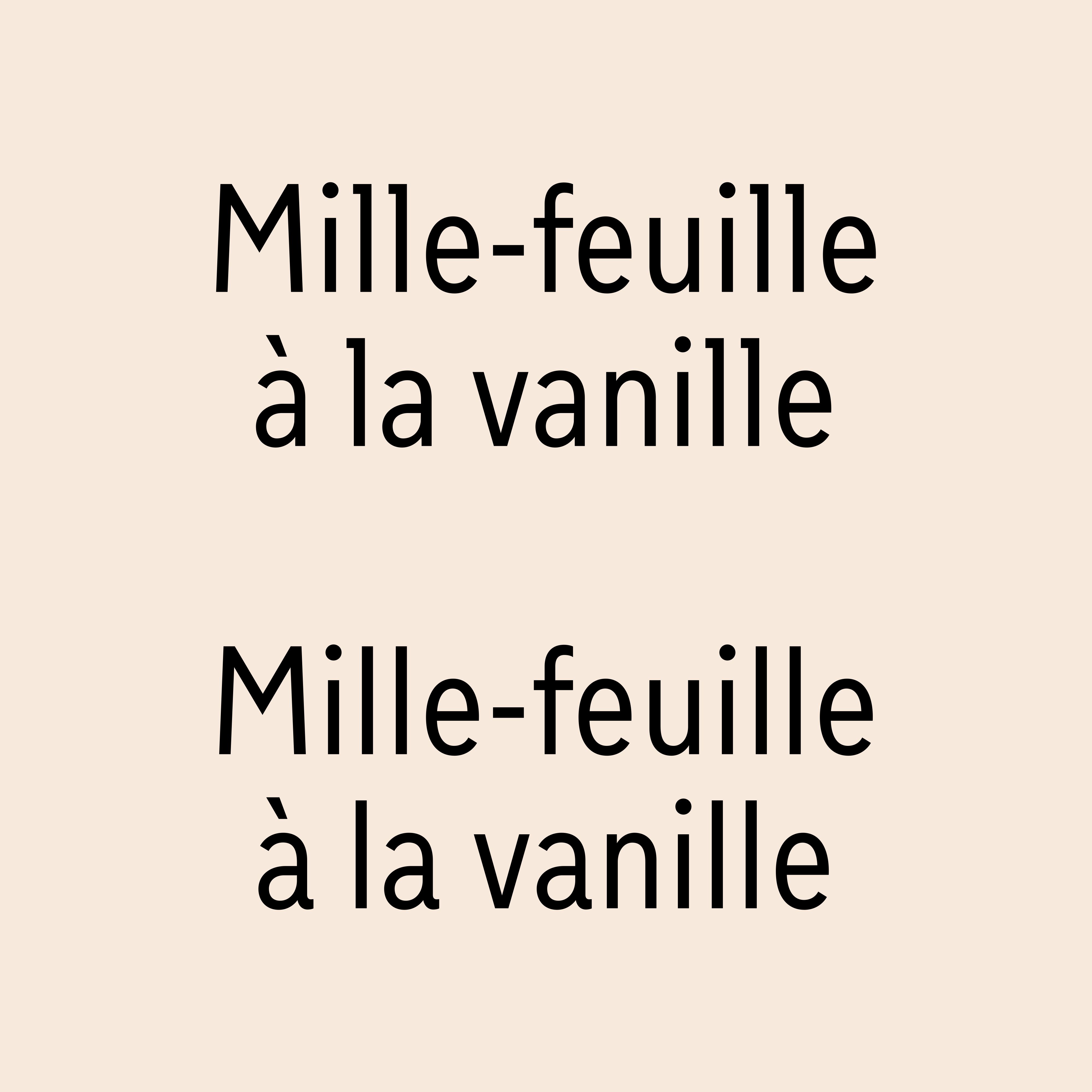
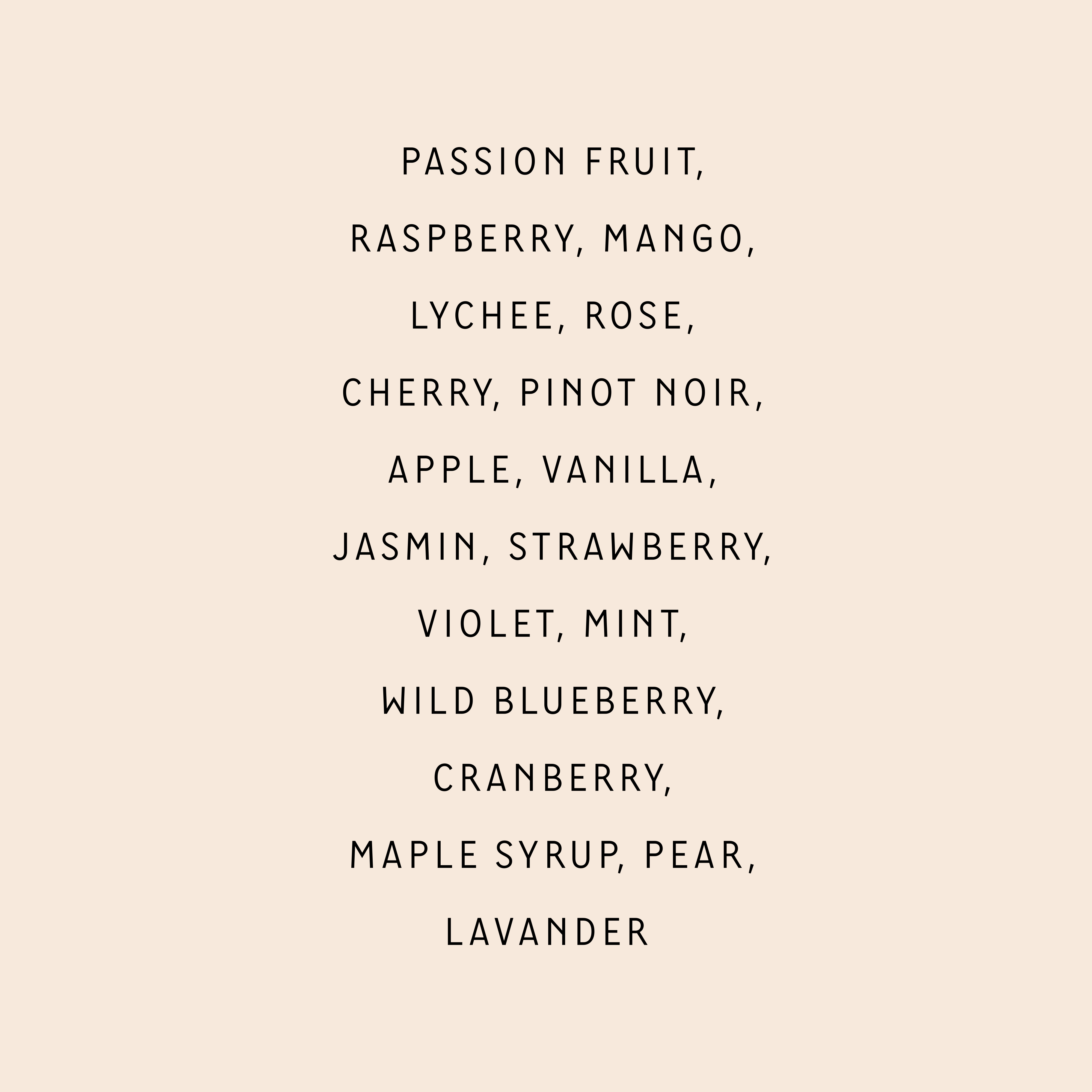

The Croissanterie typeface is a low contrast grotesque sans-serif with moderately open aperture that combines features of text and display fonts. It ensures high readability for paragraphs and distinctive decorativeness for headlines.
The set of wide and narrow styles with alternative letters makes the typeface multi-functional and all-purpose.

Awards
︎ Graphis Awards 2020
Gold in Design annual
Gold in Design annual
︎ Graphis Awards Packaging 11
Silver in Packaging design
Silver in Packaging design