Olkom: Selyanske and Vershkove
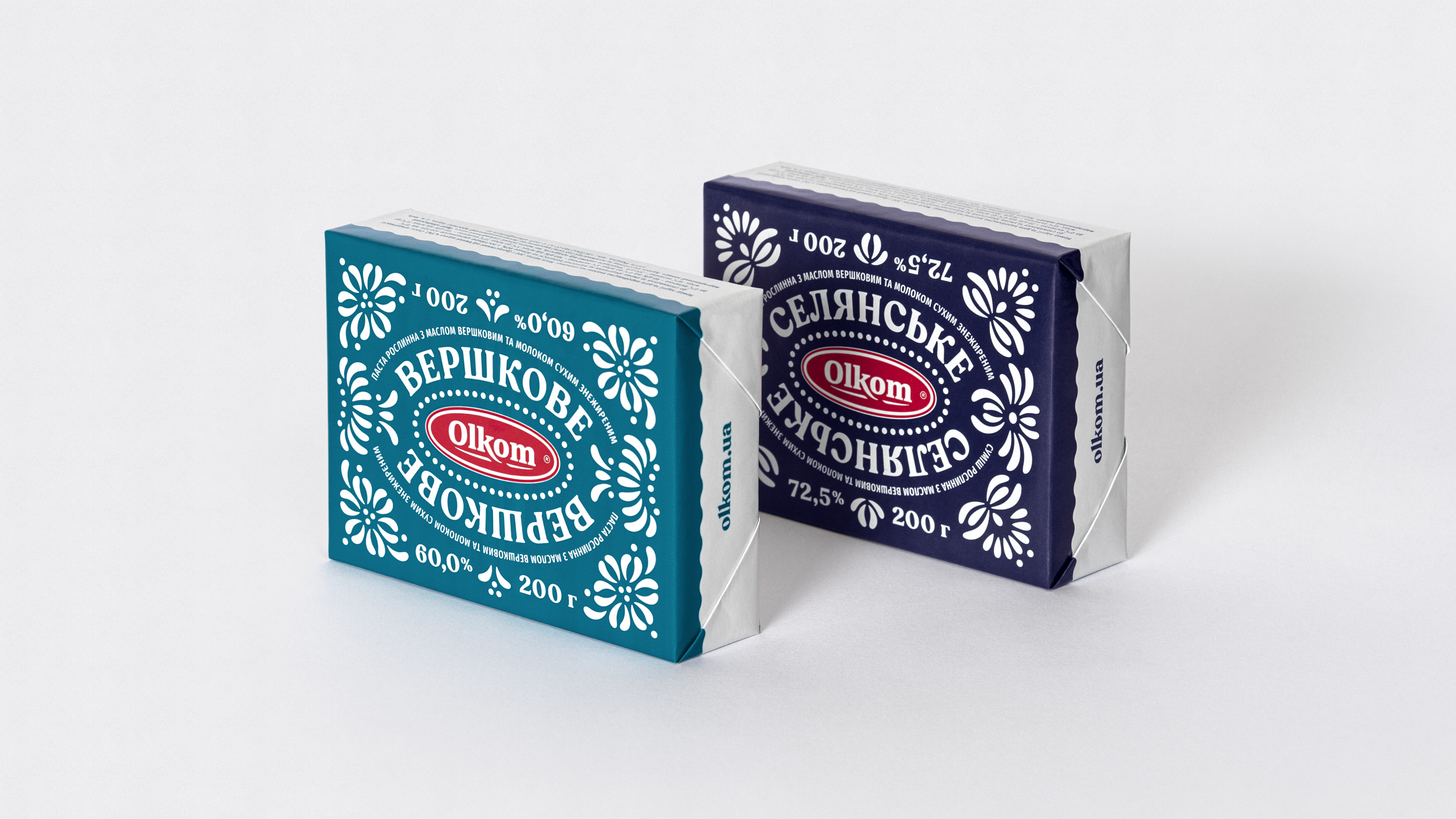
Olkom, a brand famous for its sunflower oil-based products, launched a new series of high-quality spreads that combine vegetable and milk fats. The product does not contain trans fats and aims to substitute butter for cooking without compromising the taste. In addition, the brand is brave enough to compete on price. The challenge was to create the appearance of Olkom spread that stands out in both categories: butter and spread.
Client: Olkom
Services: Visual strategy, Art direction, Packaging.
Year: 2020
Services: Visual strategy, Art direction, Packaging.
Year: 2020


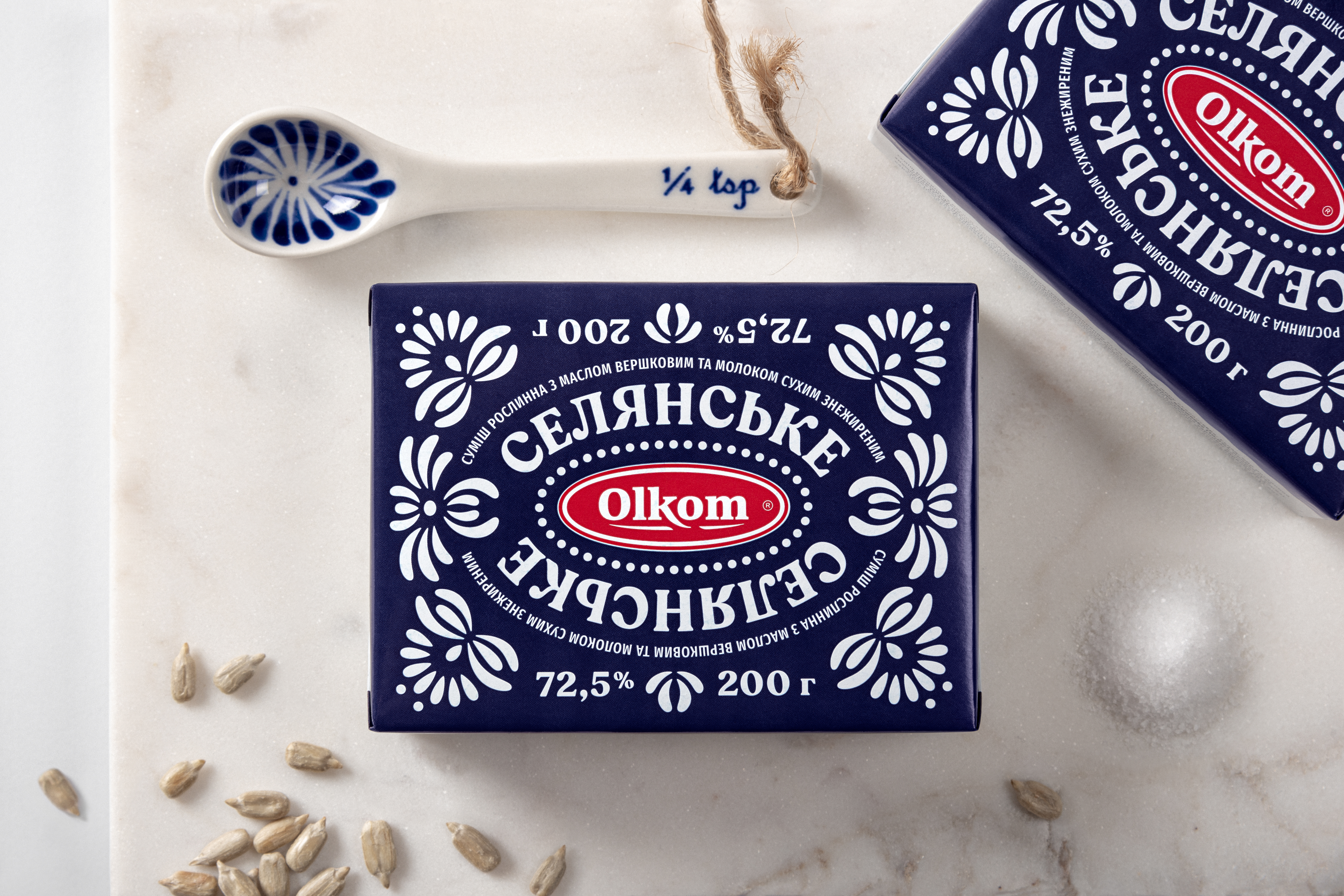
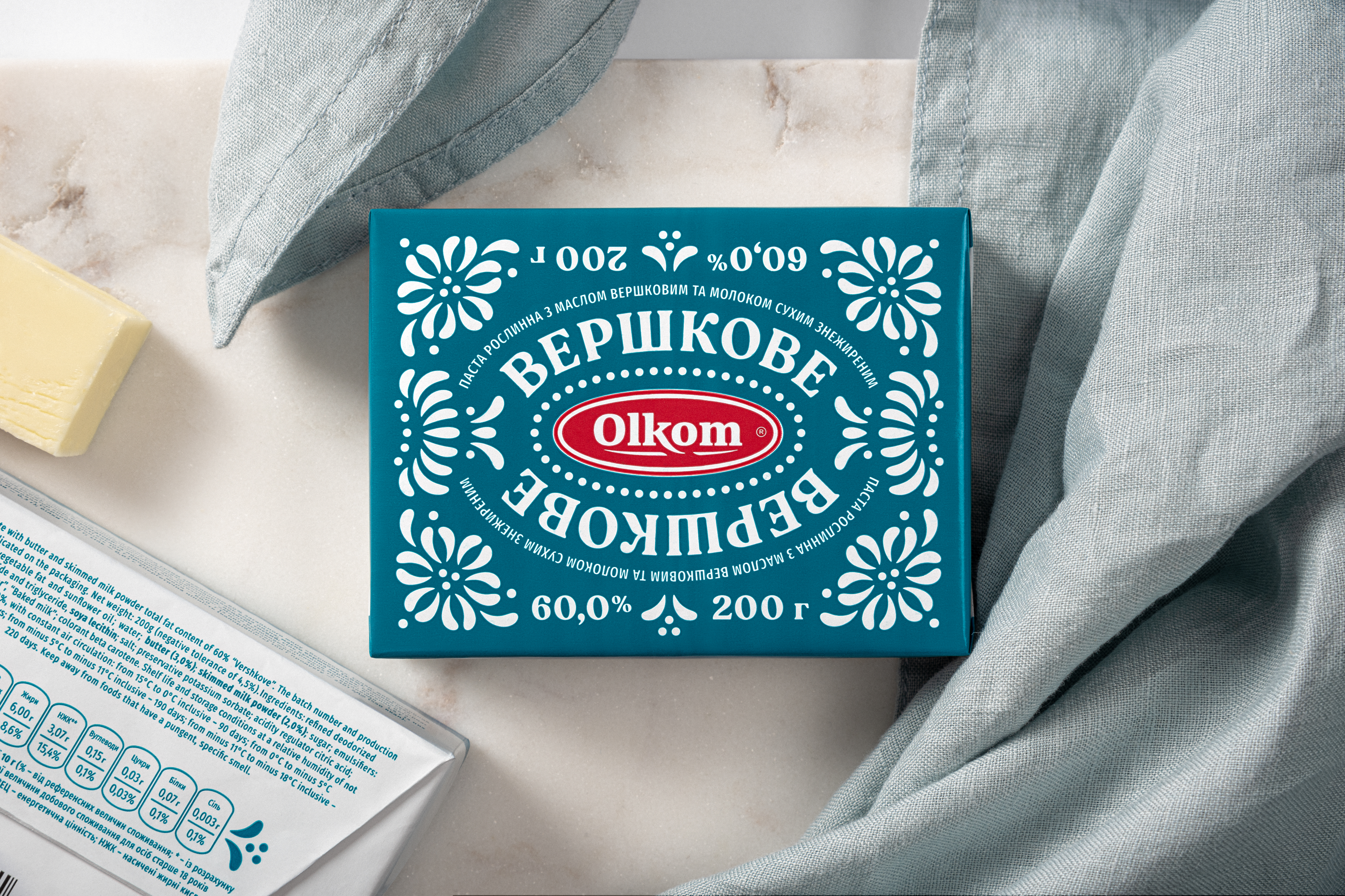
The design combines the "milky" countryside aesthetic with floral patterns that indicate the vegetable origin of the fats. As a source of inspiration, we took traditional Ukrainian folk crafts to communicate homemade and natural food. Famous Petrykivka art became the base for the ornaments' structure. However, we slightly reimagined its style to make it look contemporary and cross-cultural.
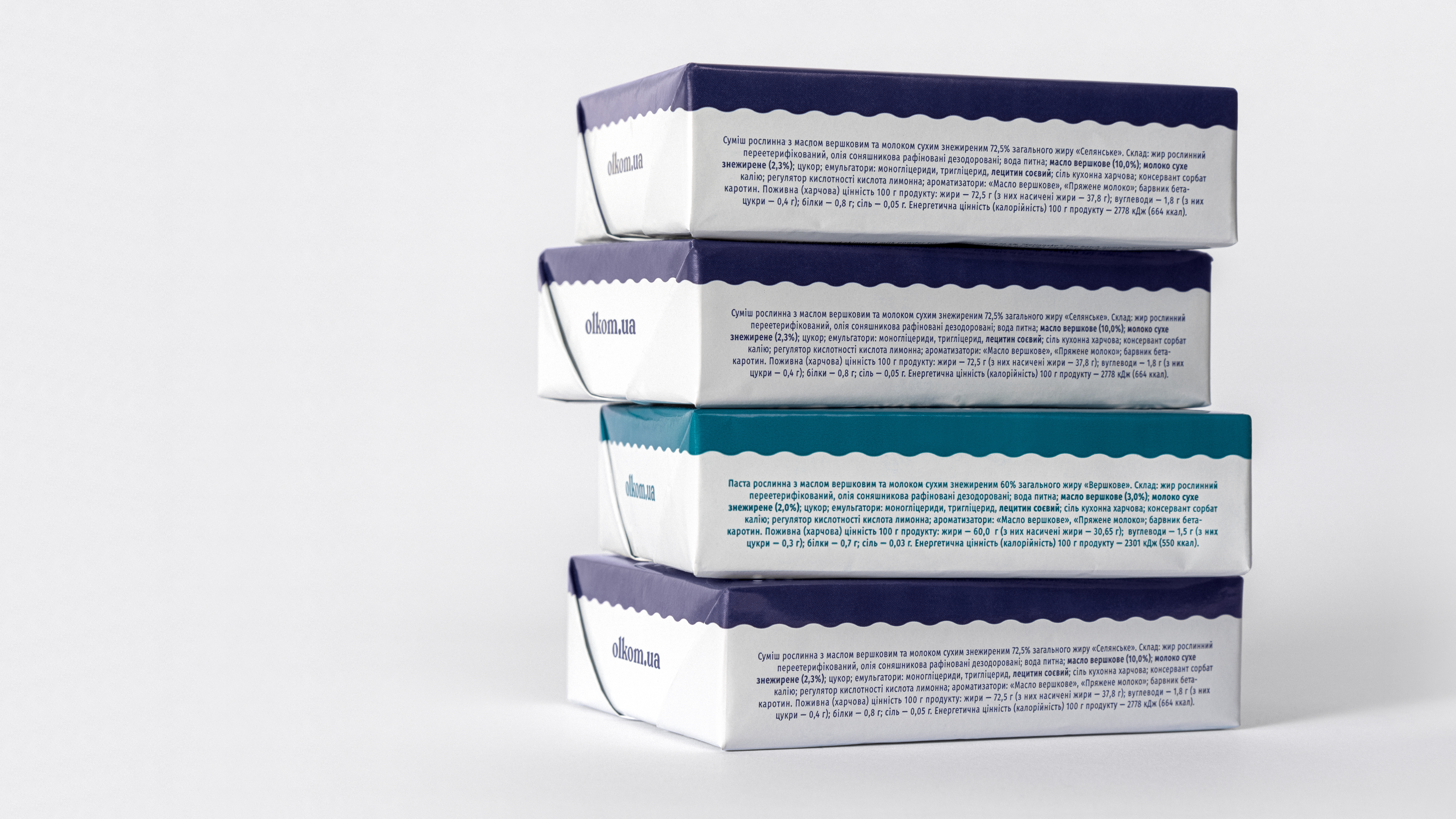
The color palette is typical for dairy offerings yet rare for a spread. It conveys a chilled, fresh, and pure product. A prime design trick of the packaging is that one can display it upside down without harming the identification and overall impression. Only the logotype has direction, but it is recognizable in any position. Besides attractive oddity, it allows the packaging to look good on a table or in a horizontal supermarket fridge with 360 degrees of observation. Also, it helps avoid risks of improper placing on the shelves.


Awards
︎ Graphis Awards Packaging 10
Silver in Packaging design
Silver in Packaging design