Ridna Marka
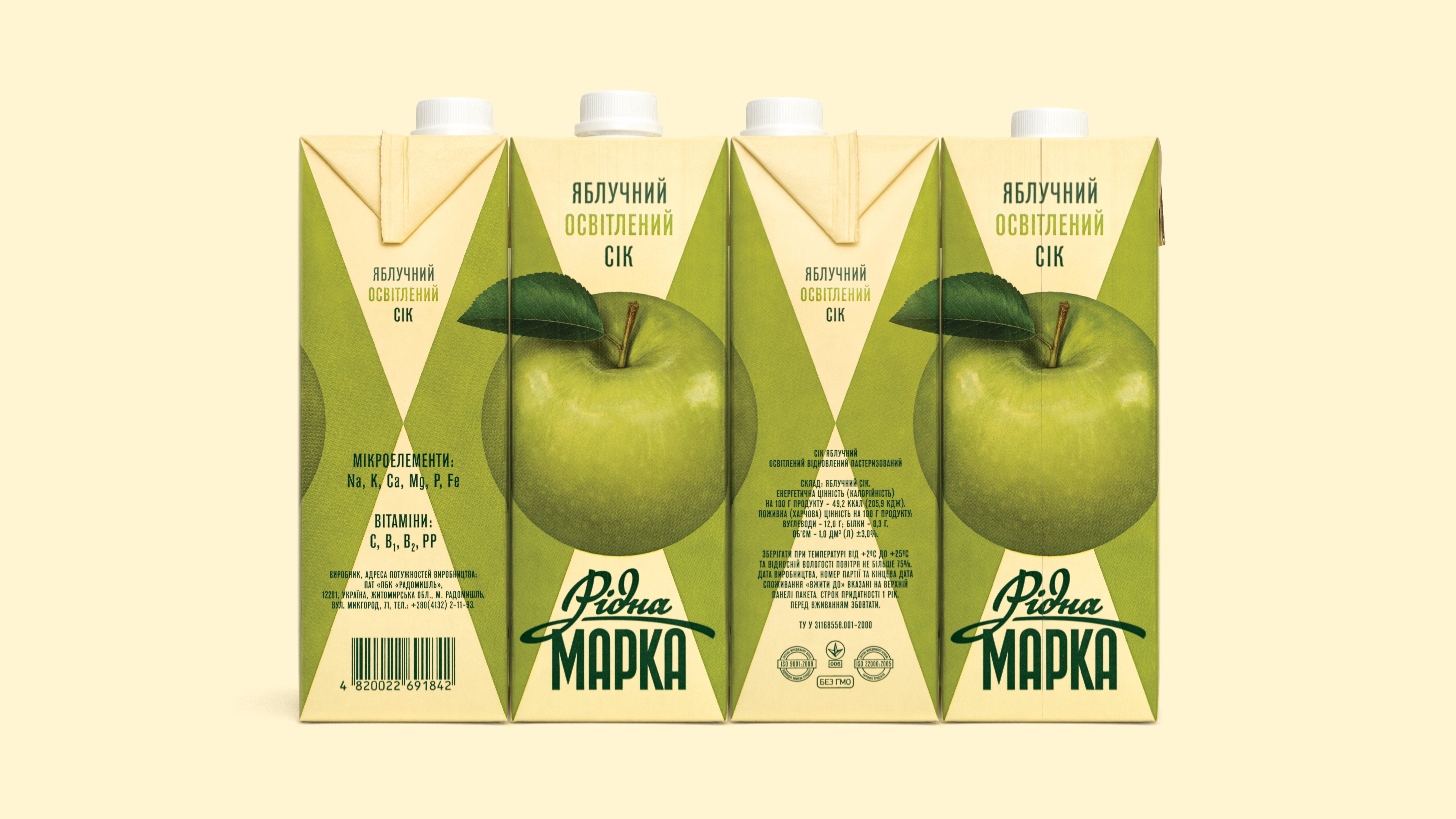
Ridna Marka juice series is a selection of popular national flavors: apple, orange, tomato, and cloudy apple. The brand focuses on quality instead of variety and creates a nostalgic aura of the old days when the sky was brighter, the fruits were sweeter, and life was simpler. The challenge was romanticizing retro packaging while keeping it modern and marketable. We found inspiration in grocery design from the 60s and 70s. We analyzed posters, magazines, book covers, and even movie titles of mentioned epochs to get the right feeling of the era. Even the name Ridna Marka sounds old-fashioned and means Native Brand in Ukrainian. Altogether, it helps build a solid brand identity and stands out in the highly competitive beverage segment.
Client: The First Private Brewery Group
Services: Visual strategy, Art direction, Packaging, Illustration, Typography, Photography.
Year: 2014
Services: Visual strategy, Art direction, Packaging, Illustration, Typography, Photography.
Year: 2014


Awards
︎ Red Dot Design Awards 2015
Red Dot in Packaging design
︎ Communication Arts Design Annual 2015
Winner in Packaging design
︎ Dieline Awards 2014
Gold in Non-alcoholic beverages
︎ Yerevan International Advertising Festival 2014
Gold in Graphic design (Packaging)
Red Dot in Packaging design
︎ Communication Arts Design Annual 2015
Winner in Packaging design
︎ Dieline Awards 2014
Gold in Non-alcoholic beverages
︎ Yerevan International Advertising Festival 2014
Gold in Graphic design (Packaging)
︎ Art Directors Club Ukraine Awards 2014
Gold in Graphic design (Packaging)
︎ Pentawards 2014
Silver in Beverages (Soft drinks and juices)
︎ Kyiv International Advertising Festival 2014
Silver in Graphic design (Packaging)
Gold in Graphic design (Packaging)
︎ Pentawards 2014
Silver in Beverages (Soft drinks and juices)
︎ Kyiv International Advertising Festival 2014
Silver in Graphic design (Packaging)